MILAN (ITALPRESS) – The Il Sole 24 ORE Group chooses identity as an evolving lever: a new name, a new logo, a statement that affirms the depth of its history and the richness of the Group, projecting them into a new vision of the future.
The leading editorial group in Italy in economic, financial, regulatory and cultural information inaugurates a new phase by announcing a new brand identity, based on clear, symbolic and highly recognizable identity choices.
At the heart of this evolution, first of all, the passage in the naming from Group 24 ORE to Gruppo Il Sole 24 ORE. An act of valorisation of the information, cultural and civil heritage that for more than 160 years has been a reference point for the entire country. Because “The Sun” is not only historical heritage, but a living resource, able to guide innovation ensuring consistency, credibility and authority.
This choice is accompanied by a new visual brand, able to interpret in a renewed garment and in a single logo all the assets that constitute its value: the first and only multimedia platform in Italy that not only includes, but integrates daily, digital, news agency, radio, television, books, podcasts, professional publishing, training, exhibitions and events, together with initiatives and services dedicated to professionals, businesses, business community, institutions and society all.
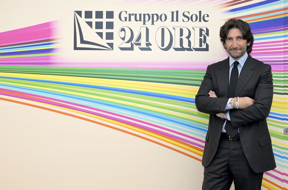
“To guide us on this path aimed at drawing our future was a fundamental principle: the need to represent, in an authentic and contemporary way, the identity and essence of our ecosystem,” explains the Group CEO Il Sole 24 ORE Federico Silvestri. “This is why we decided to retrace our history and “make square” in connection with our tradition, our culture, our values, our people. A symbolic square that becomes a brand and takes body and three-dimensionality: symbol of constant development in the continuity of authority, and that today reveals a composite heart that projects us in the future. Because drawing a new identity means reaffirming who we are in the present and directing the future. It is therefore our inheritance to guide our evolution.”.
This vision is the new brand of Il Sole 24 ORE, designed by Studio FM Milano. Inspired by the historical brand of the past, which represented the passage, at the beginning of the 1990s, from newspaper publishers to editorial group that opened itself to professional publishing, conferences and training. The brand then in the original symbolism combined newspaper sheets to a keyboard, today evolves with newspaper sheets that reveal a world of pixels, expression of technological and digital advancement and, together, the Group’s multimedia nature.
Starting from the single-chromatic institutional version of the logo, a creative version was also studied where each pixel colored to represent a verticality, a world, a specificity of the Group. The result is a precious interactive, dynamic and coherent mosaic, where all the elements come together in a unitary image, able to transform plurality into an integrated, organized and recognizable ecosystem.
Different colors for different souls, whose multiplicity increases its value through integration. The new logo of the Il Sole 24 ORE Group contains all these souls, starting from the heads and means: the newspaper, Radio 24, the news agency Radiocor, and the last born among the media, IlSole24OreTV. And in turn it derives new reference logos for all business units, areas, companies and initiatives of the Group: The Sole 24 ORE Professional, a reference point for the world of professionals, companies and public administration through a system of products, services and initiatives that are indispensable; 24 HOUR Events, which designs and realizes events for the dissemination of the Sole 24 Hours, with hundreds of events in active and a calendar of appointments also for the 2026 rich of news; 24 ORE Culture that from editorial activity to museum management to large exhibitions promotes culture as a bridge between different worlds; the dealership 24 ORE System, the advertising network for the market with the publications of the Group 24 ORE and other prestigious national and international publishers; to these are joined today innovative design born from the synergy of knowledge and competences of the Group, like 24 ORE Podcast, the family brand that collects the original productions of the Sun 24 Ore and Radio 24 and the projects made in synergy with the other areas of the Group, 24 ORE Health, the innovative multimedia hub with all the information of the group for companies in the sector, institutions and citizens, and 24 ORE Factory, the structure that coordinates the audiovisual productions of Group. To communicate the new brand identity of the Group an important online communication operation realized by Serviceplan Italia within the building of Viale Sarca in Milan: scenographic coatings to communicate to employees, collaborators, guests, on the one hand, the new logo and the ecosystem of reality that make up the Group, and on the other, the values that this expresses and radiates from the pay off “Presents to the future”, which also accompanies the rebranding video and the communication campaign planned on internal and external means of the Group. In particular, on the day of launch a domination on the Sun 24 It will present both the new institutional logo and the creative and multicolor development of the Group’s coordinated brand identity.
The operation is also aimed at expressing the values that always represent the Group, today reinterpreted and, as the pay off “Present to the future”, projected in a game of words loaded with meanings: Authoritativeness and Involvement, Depth and Speed, Tradition and Innovation, Human Talent and Technology, Standing and Vision.
– press office photos The Sun 24 Hours –
(ITALPRESS).